

From events to charts - in real time
Build dashboards with funnels, retention curves, time series, Sankey diagrams, and maps. No SQL, no data team required.
- 7+ chart types
- Real-time dashboards
- No SQL required
- Export & share
What is data visualization?
Tracking events is step one. Turning those events into charts and dashboards is where decisions happen.
Product analytics dashboards let you see trends, spot problems, and measure experiments. Without visualization, you're staring at raw event logs. With it, you can answer questions like:
- Is signup conversion improving this month? → Check the funnel chart
- Are users coming back after week one? → Check the retention curve
- Where do users go after the pricing page? → Check the Sankey diagram
- How are page load times distributed? → Check the histogram
- Where are my users located? → Check the map chart
- How does daily active usage trend? → Check the time series chart
OpenPanel gives you all of these chart types out of the box. Every chart is powered by the same events you already track-no extra instrumentation, no data pipelines, no SQL.
Chart types in OpenPanel
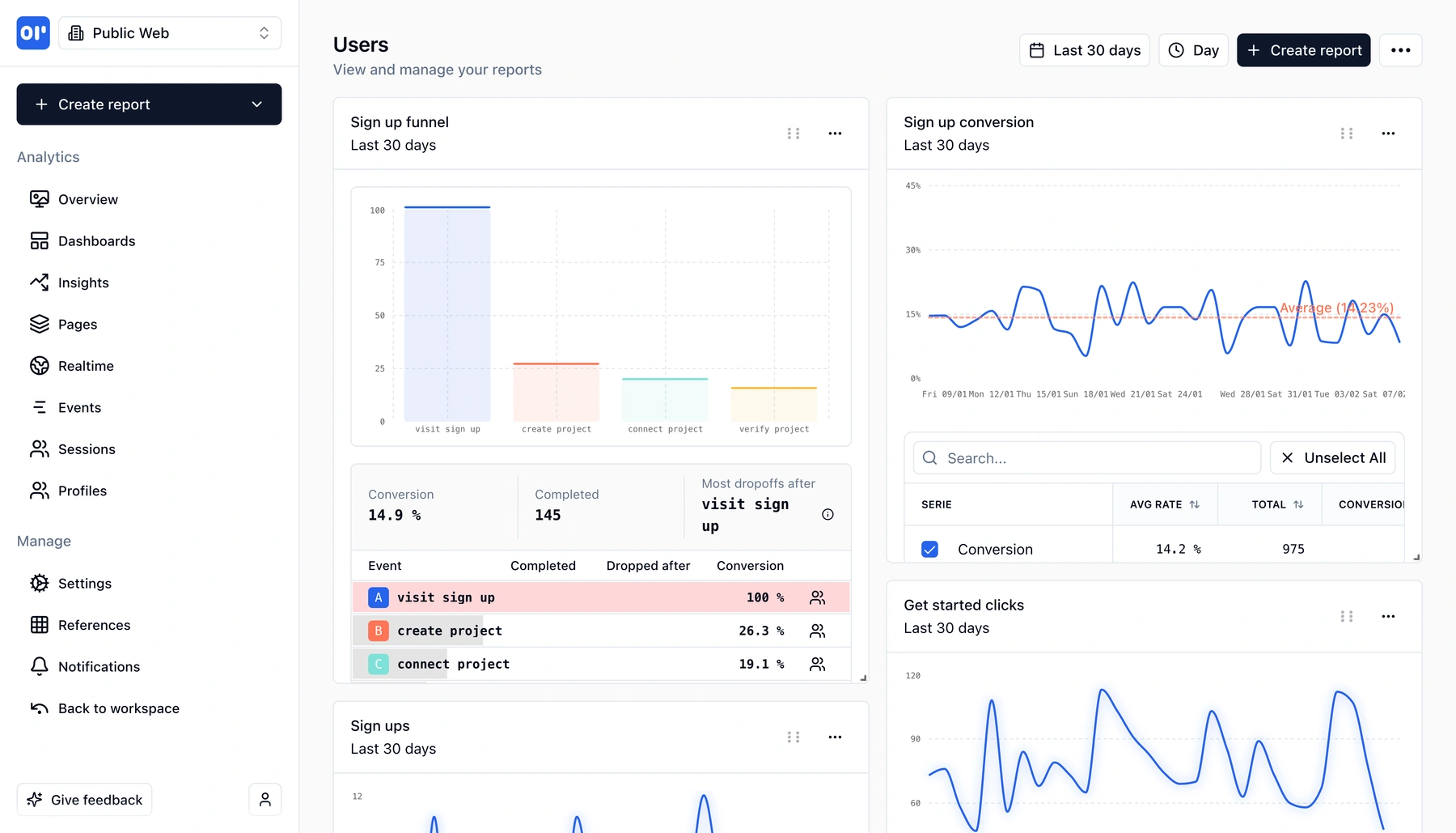
- Funnels - Visualize step-by-step conversion. See exactly where users drop off in signup, onboarding, or purchase flows.
- Retention - Measure how many users come back after day 1, week 1, month 1. Understand whether your product is sticky.
- Conversion - Track goal completion rates over time. Compare conversion across segments, campaigns, or product changes.
- Sankey diagrams - Map user journeys visually. See every path users take through your product and where they branch or exit.
- Maps - See where your users are, geographically. Understand regional adoption and plan localization.
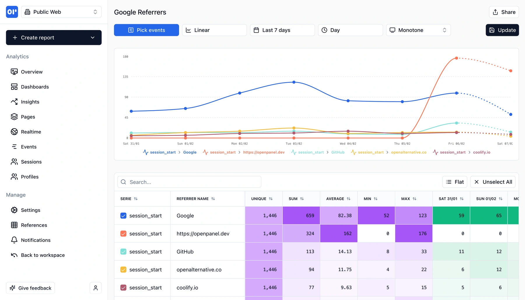
- Time series - Plot any metric over time. Track daily active users, event volume, revenue, or any custom metric with flexible date ranges.
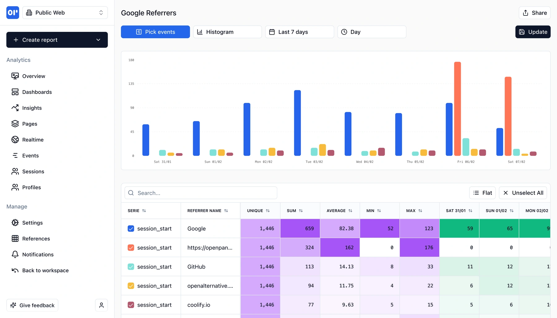
- Histograms - Understand distributions. How long do sessions last? How many actions do users take? See the full shape of your data.
You can combine these charts into dashboards that update in real time. Pin the reports that matter, share them with your team, and check them daily-no waiting for a weekly report email.
Charts and dashboards built for product teams
Every chart type is designed to answer a specific product question. Pick the right one and get answers in seconds.
Funnels
Visualize multi-step conversion flows. See drop-off at each step, compare segments, and find where users abandon signup, onboarding, or purchase.
Retention curves
Measure user stickiness over days, weeks, or months. See cohort-level return rates and understand long-term engagement.
Conversion charts
Track goal completion rates over time. Compare conversion across campaigns, plans, or product versions.
Sankey diagrams
Map user journeys as flow diagrams. See every path through your product-where users go, where they branch, and where they exit.
Maps
Visualize user geography on an interactive map. Understand where your users are and how behavior varies by region.
Time series
Plot any event or metric over time with flexible intervals. Track trends, spot anomalies, and compare date ranges.
Histograms
See distributions of session length, event counts, load times, or any numeric property. Understand the shape of your data, not just the average.
Real-time dashboards
Combine any chart types into dashboards that update as events arrive. Pin the reports your team checks daily.
How data visualization works
From raw events to shareable dashboards in three steps.
Track events from your product
Send events with our SDK or API. Page views, signups, purchases, feature usage-every event becomes a data point you can chart.
Pick a chart type and build a report
Choose funnels, retention, time series, Sankey, maps, histograms, or conversion charts. Select your events, add filters, and see results instantly.
Pin to dashboards and share
Save reports to dashboards your team can access. Charts update in real time as new events arrive-no manual refresh or export needed.
Who uses analytics dashboards
Anyone who needs to turn product data into action.
Product managers
Build dashboards with funnels, retention, and conversion charts to track feature launches and measure whether product changes move the needle.
Growth teams
Use Sankey diagrams to map user journeys, funnels to optimize conversion, and time series to measure campaign impact over time.
Founders and operators
Get a single dashboard with the metrics that matter: active users, conversion, retention, and revenue trends. Check it once a day instead of running ad-hoc queries.
Engineers
Use histograms and time series to monitor event volume, track performance distributions, and spot anomalies without setting up a separate observability stack.
Related features
Explore more capabilities that work together with this feature.
Frequently asked questions
Common questions about data visualization and analytics dashboards in OpenPanel.
Ready to get started?
Track events in minutes. Free 30-day trial, no credit card required.
Start visualizing your data